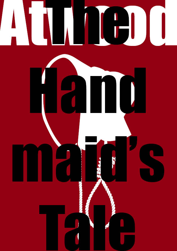
In this exercise I was asked to look at different covers designed for a book throughout the years and see the differences between them and identify what ties them together.
The book The Handmaid’s tale by Margaret Atwood was suggested as such. This book was first published in 1985, and has seen a number of re-releases since. I have heard about this book many times but have not read it myself. I have started to listen to the book as an audiobook whilst doing some research on the previous covers for the book.
Found a really good resource with covers of the book listed by year and designer.
Title: The Handmaid’s Tale (isfdb.org)

Designed by Tad Aronowicz (1985) 
Designed by Fred Marcellino (1986) 
German edition from 1990 – Published by Reclam Leipzig 
1991 published by Fawcett Crest / Ballantine 
German edition 1992 – Published by Fischer Taschenbuch 
1993 published by William Heinemann 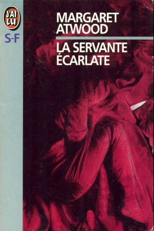
1995 published by J’ai Lu – Cover art credit on bc, “from the fils poster by Volker Schlöndorff” 
Designed by Fletcher Sibthorp (1996) 
1998 published by Seal Books 
German edition – 1998 published by Claassen 
Designed by Noma Bar (1998) 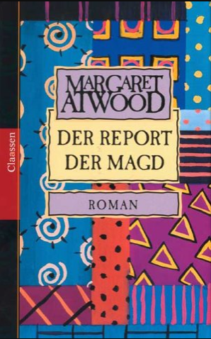
German edition – 2001 – published by Classen 
Hungarian edition – Unknown designer 
Hungarian edition – Unknown designer 
2006 Published by McClelland & Stewart 
2006 published by Alfred A. Knopf 
German edition 2006 published by List 
2009 published by Bloomsbury 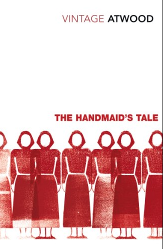
2012 published by Vintage Digital 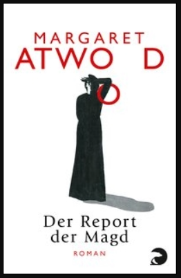
German edition 2016 published by Berliner Taschenbuch 
2016 published by Vintage Children’s Classics 
2017 Published by Vintage UK 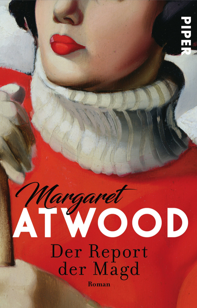
German edition 2017 published by Piper (Germany) 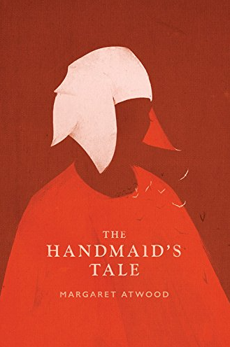
Designed by Patrik Svensson (2017) 
Portugese edition from 2017 published by Rocco 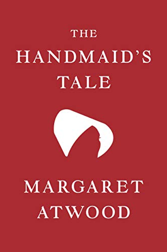
2019 – published by Houghton Mifflin Harcourt 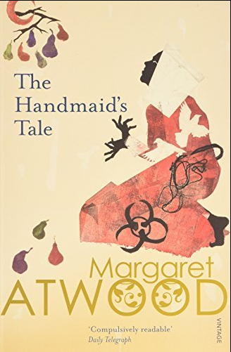
Designed by Florence Boyd 1996 published by Vintage (UK)
I tried to find as many different versions of the cover as possible. What seems to tie these covers together the most is the colour red and the depiction of the bonnet that the handmaids need to wear in the novel.
In terms of their closer context, things seem to have started to change to make these elements more of a focus after the first film adaptation of the novel in 1990. Perhaps the movie itself have captured the imagination of cover designers and lead them down on this path.
Here is a trailer for the movie.
I also found a good comparison video on YouTube that analyses the differences between the book and the TV series that was based on the novel.
This gave me another great insight into the story and I feel like I am ready to start designing the cover. I think the elements are quite obvious, I will attempt to include the following:
- Bonnet
- Colour red
- Autor’s name
- Novel’s title
I really liked the flat minimalistic design by Noma Bar, and wanted to use a similar approach. I think this will also benefit most from being changed around in the frame to create different layouts. My plan is to start by creating one cover which I can change around to create different variations of.
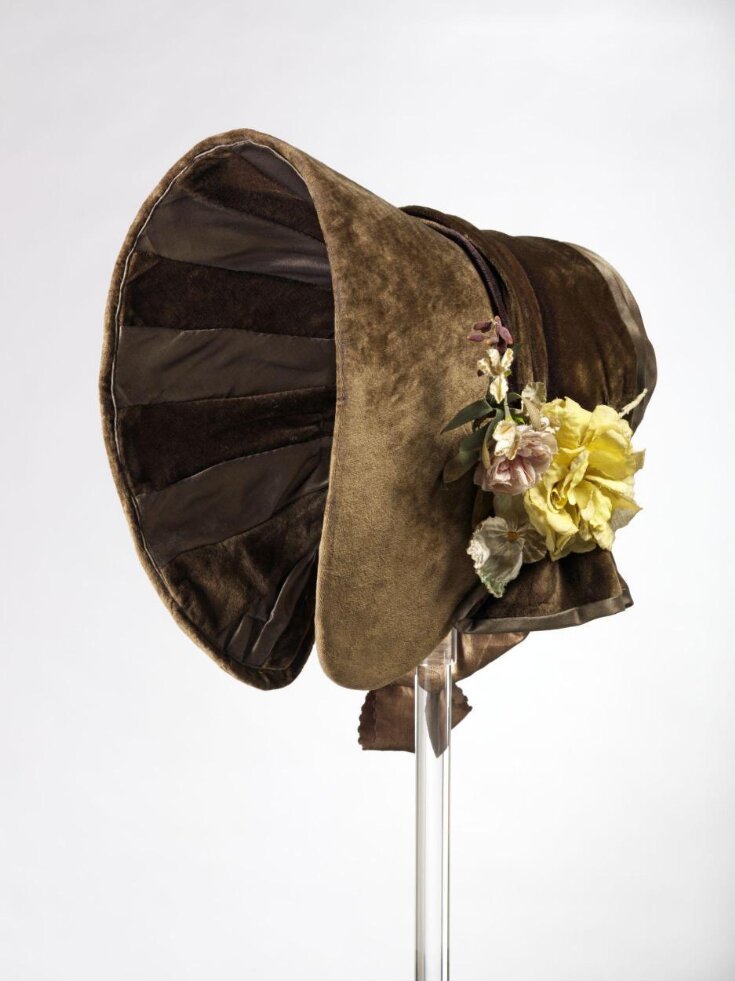
Found a bonnet image on Google that I thought will work fairly well as a basis for my motif.

Another element that stood out to me was the rope where they were hanging some of the outlaws at the square, so I really wanted to try to see if I could perhaps include a noose, perhaps as the tie for the bonnet.

Noose image source: Hangman’s noose, close up – JRF00106 – Julian Rupp/Westend61

I found this exercise really inspiring. It is astonishing how many different versions you can create just using simple elements, and how the simple elements such as the font use can make a massive difference in terms of the feel of the cover.
I think my favourites are the last couple. I could imagine one being on the dust jacket and the other one underneath on the actual book board.
Conclusion
While the covers are relatively simple, I am quite impressed with how they turned out. I think this is mostly because I had a strong foundation to build on by doing thorough research into the previous covers for this novel and the story itself. I feel like this exercise has shown me once again that working in a modular fashion so that I can play with the individual elements is super important. Once you have come up with an idea you should try to iterate and reflect to find ideas that work best.


