
In this exercise I was asked to undertake some research into the work of specific book designers and see how they contrast with each other, with the norm of the book genre and in their approach to design. Do this in a format that reflects the designer’s style.
Select 3 from the list that I find most interesting and further analyse these and try to figure out why I find them most interesting.
Finally find some more book designs that I like and figure out what sort of design I am drawn to and what makes these designs tick.
This will be quite a chunky exercise I think, but from previous experience I think this will be very worthy research that will feed into my work going forward so I am looking forward to delving into book designers a little more.
The designers to research:
Phil Baines
I started with Phil Baines and recorded my notes in his style.

Coralie Bickford-Smith
I really enjoy Bickford-Smith’s approach to cover design. Her book covers look really interesting to look at with her use of repeating patterns and strong silhouettes. I made the below page to capture what her style is all about in my opinion.

Derek Birdsall
Derek Birdsall’s work is simple yet effective. I really like the minimalism that he employs in his designs, making covers that pack a punch without being overly complex. The use of strong colours and simple typography delivers the message effectively.

Kelly Blair
Kelly Blair’s style is quite hard to pin down. She is an illustrator and designer and as such her book covers are full of great illustrations. Her covers are very poster like in comparison with the first few designers that I looked at thus far. Her style is pretty eclectic, so I struggled to put together a spread for her, but here is what I come up with.

Irma Boom
Irma Boom is a Dutch designer who’s work is very art book like most of the time and very conceptual. Her approach to book design is quite different. She looks at the advent of digital publishing as an opportunity for designers of physical books rather than the beginning of the end.
If I needed to describe her work I would use the below keywords:
- Conceptual
- Experimental
- Textural
- Physical
- Unusual
- Scale
Found this interview with her which I found really interesting.

Suzanne Dean
After the success of the previous part, I really wanted to carry on with my research to include Youtube in case I can find other interviews. I found this with Suzanne Dean.
Although this interview was good, she didn’t really showcase much of her work so I had to go off and find other sources to find out more about her style. That said it was really interesting to find out more about her background. She started in package design but found it too restricting creatively and so she has moved into book design. She is now the art director for Penguin Vintage. I was browsing the Penguin website, but annoyingly it does not cite the cover designer for each of the books in their web shop, so it was difficult to tell which books were designed by her personally. I finally found her website and started browsing through her portfolio that way which was much more useful.
Her style is quite hard to pin down I think, but mostly can be described by the following words:
- Adaptive
- Conceptual
- Illustrative
- Textured

Julia Hastings
I found this interview with Julia Hastings on Design Indaba.
http://www.designindaba.com/videos/interviews/julia-hasting-unusual-book-designer
I found her approach to book design really interesting and exciting. The way she deals with books as physical objects is really inspiring, I think she has a similar approach to Irma Boom’s. Her book Cream seems super interesting, and I really like the concept that it was wrapped as if it was a food item to preserve its freshness. Sounds like an experience you could not have with digital books at all and she seems to be really against the digital publishing in general.
- Unusual
- Connected
- Special packaging
- Anti-digital
- Deconstructed
I was browsing her website in complete awe! Her designs are really outstanding. I really like her way of challenging what a book can be. Especially like where she have broken away from the usual binding and form of the book. I think this is what makes her designs really special. I also like how her unusual design choices are not just gimmicks but a functional part of the book as well that speak of the content is some ways.

Linda Huang
- Depth
- Typography
- Collage
- Hand written
- Textured

Jost Hochuli
I was researching Jost Hochuli and found the following flip-through of some of his work:
I found his designs delightfully minimal. Playing with space quite a lot by reducing the margins for example. Really liked the look of the book jackets that were very simple and minimalistic.
- Typography
- Minimalism
- Book jackets
- Whitespace

Ellen Lupton
- Funny
- Playful
- Symbolic
- Typographic

Peter Mendelsund
I really liked this flip-through of the above book. The pages look really thin and delicate, and I love how the book is black and white yet it feels fresh and modern.
The keywords I have collated on Peter Mendelsund are:
- Eclectic
- Humorous
- Doodles
- Conceptual

Paul Rand
- Rough shapes
- Worn edges
- Colour blocks
- Texture

Paula Scher
I was scouring the internet to try and find some cover designs by Paula Scher, but I found nothing. What I did find was a very inspiring speech by her where she described how different types of play exist in graphic design and what separates them from each other. I found this super inspiring.
If I were to describe her graphic style I would describe it with the following words:
- Typographic
- Bold
- Disruptive
- Contrasting

Jan Tschichold
- Modernist
- Asymmetric design
- Typography
- Sans-serif

Wolfgang Weingart
- Experimental
- Bold
- Wild
- Contrasty

Design comparisons
Next I was asked to compare and contrast some of the covers that were made by some of the listed designers. I started by looking at the Kafka series by Peter Mendelsund and the Gothic Horror series by Coralie Bickford-Smith as suggested by the exercise text. It was an interesting comparison especially in context of their predecessors. It was interesting to see how both of these designers tried to break away from what is expected for a certain topic or author and come up with something fresh to bring these novels into the current time.

Made some comparisons between a cover by Ellen Lupton and another by Jan Tschichold as per the description in the exercise. I pulled out the similarities and the differences between the 2.
I found this quite interesting because the 2 designers are from 2 completely different generations, and given the time difference I would have imagined that the difference would be much greater. Is it possible that Lupton has taken inspiration from Tschichold? Is it because Tschichold has been such a pioneer that his designs still stand today? Possibly a combination of these 2 elements that made these 2 books so similar.

In depth research of selected designers
In this next part of the exercise I was asked to delve into some of the designers that I liked or found most intriguing from the above list.
I have selected the following 3.
- Irma Boom
- Julia Hastings
- Paula Scher
Mostly chose these designers due to what I found out about them whilst I was doing my initial research. I really liked their approach to book design and wanted to explore them a little further.
Irma Boom
Boom’s work is really fascinating. I really like how she takes book design and its constraints and completely blows them apart to show what else a book can be. I especially like this book that she has designed for fashion house Chanel. Chanel: Livre D’Artistes is not printed using ink but uses an embossing technique instead. I am fascinated by the tactility of this design.
She explains that the inspiration behind creating a book like this was partly a personal one. The way you feel when you put on perfume. It is not visible, but rather a feeling. This is what she portrayed in this incredible piece of art.

She wasn’t always working on such big and exciting projects though. In this interview she explains how she has started her career at the Dutch Government’s Printing office and how the work there was very controlled and had to fit certain guidelines and briefs. She has started working on smaller projects that nobody else wanted to do, where she was able to get away with more experimental design.
From this era, her stamp books are outstanding! I really like the way she uses Japanese binding where the pages are doubled up and each page has a reverse side that in invisible and often the things on one page flow over to the next but not across the spread but to the flip side of the page. She put the page numbers inside the pages, which were in roman numbers, so they were totally useless, but she needed to add page numbers.

As a whole I find her career and her work really inspiring, I feel like it was worth doing this exercise just to learn more about her work.
Sources:
- Quick Design History: Irma Boom #ThrowbackThursday – Shillington Design Blog (shillingtoneducation.com)
- A Genius of Book Design Creates a Tome With No Ink | WIRED
- Irma Boom – Wikipedia
Julia Hasting
Bio
Julia Hasting (born 1970 in Bremen, Germany) lives and works in Zürich.
About – Julia Hasting
She is the creative director of Phaidon Press. She studied graphic design at the Staatliche Hochschule für Gestaltung in Karlsruhe, Germany, and finalized with a diploma. From 1993 to 1998 she has been designing corporate identities, posters and books for cultural clients, then she moved to London to design books for Phaidon Press, working closely with Alan Fletcher. In 2000 she moved to New York in order to run the new design department as the Art Director for Phaidon Press Inc., and in 2007 she has taken over the design direction at Phaidon Press and moved to Zürich, Switzerland. She taught Publication design at the design faculty of the Cooper Union School of Art in New York from 2001 to 2003. She has given lectures about her work at the BRNO Biennale of Graphic Design, The AIGA New York, Pentagram New York, F.I.T., the University of Lima, Peru, Integrated Design Conference, Antwerp, and has been a jury member in numerous international design competitions. Since 2003 she has been contributing illustration work to The New York Times and The New York Times Magazine. She is a member of the AGI since 2000.
I think I am drawn to her designs for the same reason I like the work of Boom. Her creations are very tactile and incorporate elements that you would not necessarily think of when you think about book design. This unusual approach makes her books more of an experience than what is merely written across their pages.
The book Cream is a very good example of this unique approach. It is wrapped into a thick clear plastic. This metaphor according to the artist is about freshness of the product inside. The book is an art annual and discusses all the most relevant trends. So in a way it will go out of date just as any food product would. I really like this approach where she really went outside the bounds of book design to come up with something unique.
Sources
Paula Scher
Paula Scher is one of the most influential graphic designers in the world. Described as the “master conjurer of the instantly familiar,” Scher straddles the line between pop culture and fine art in her work. Iconic, smart, and accessible, her images have entered into the American vernacular.
Paula Scher (pentagram.com)
Luckily there is a whole episode of Abstract on Netflix was dedicated to her, so after watching this I felt like I knew quite a lot about her design philosophy and her career.
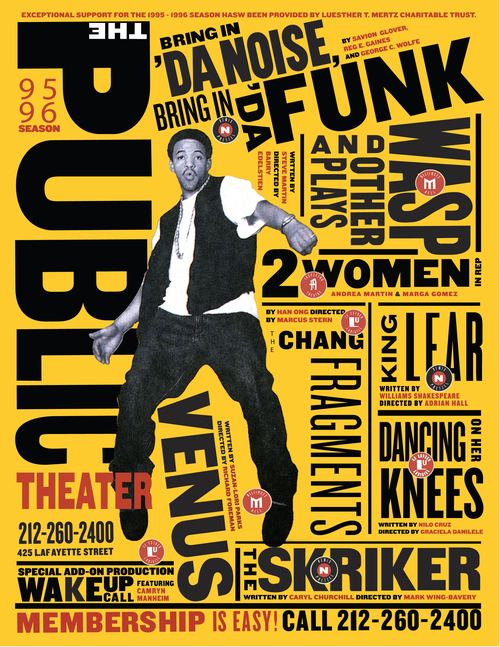
I find Scher’s designs very fresh and striking. Her work for the Public Theatre is amazing. Really like the way she approaches typography as if it was an illustration. Her graphic design work is really inspiring. She designed the Citi bank and Windows 10 logos, just to mention a few. Her designs are all about simplicity and information. Perhaps her book designs aren’t what makes her highly esteemed in the world of Graphic Design, but I think I would learn a lot just by looking at her work more closely anyways.
Sources:
Independent research of inspiring book designers
This section was much harder as due to Covid-19 restrictions I was not able to go to a library or bookshop to interface with real books, but had to do all of this research online. It can be hard to decide sometimes what is real and what is a mockup. I wanted to find books that were actually published, as this would have meant that the idea behind the book was successful enough to make it through some publisher’s scrutiny.
I started my research on Instagram and Behance, as I thought this would be the perfect visual medium where I might be able to find inspiring designs, and good designers, however I soon realised that it was not super easy to find them through these platforms.
I then turned my research to publisher houses, as I thought this approach at least will give me access to book designs that I really liked. I started with Phaidon as I really liked their approach to making books that are also beautiful objects. This approach also didn’t lead me anywhere as sadly the publisher rarely discloses the designer behind the book.
I decided to try to research designers first, and then see which ones I resonate with the most. I think this is the only viable way for now while I can’t go to a bookshop or library to browse books.
Joost Grootens
The first interesting designer I came across was Joost Grootens.
I found a very nice interview with him where he explains his career in quite a lot of detail.
His studio SJG is producing some amazing books that seem to follow a swiss style. I really like the clean designs.
I really like their approach to book design. The book covers seem to have some special materials and embossing techniques, which elevates them. Love how the they use simple typography in a multitude of ways and how every one of these books are very different yet they have a strong design language that connects them all.
I also find it super interesting how he talks about using digital experiences in his book designs; the way people use the internet has changed the way they look at information, and therefore integrating this into book design will make books more familiar to the internet generation. I find this really important and interesting as a design approach.
Also, found interesting his point about what the future of design and design education is. How the fact that design tools are now available to everyone has changed the face of the industry. Today everyone is a designer. He argues that perhaps the way it will work is that designers will design tools to enable others to design with rather than design objects. I definitely see this as a valid point.


Rodrigo Corral
Corral studied at the School of Visual Arts in New York City, where he also has taught. He has designed covers for the Pulitzer Prize winning author Junot Díaz and authors Chuck Palahniuk and John Green. He designed covers for the New York Times bestselling books Decoded by Jay-Z, Classy by Derek Blasberg, and Influence by Mary-Kate Olsen and Ashley Olsen. Corral was included in the 2018 New York Times list of best book covers.
Rodrigo Corral – Wikipedia
I really like how Corral’s designs are so different from each other for each project. I found this video of him talking about his career and work which I found very inspiring.
I particularly loved the cover design for Edge of Order by Daniel Libeskind.

I really love the way the clear dust jacket is used to create another dimension to the book cover. I think this is the type of design that excites me the most, where the designer goes that extra mile and creates something that really creates an impact. The whole lot could have been printed as one book cover, but I find this approach of having 2 covers in one much more exciting.
Another book that really stood out to me is this Harry Potter themed one on the History of Magic.


I found this book charmingly eclectic. I think I have a soft spot for the topic, but I love how the designer didn’t fall into every cliché when creating this book but still managed to keep some elements of typography that reminds us of the franchise. I think this is a difficult balance to strike and he has done it just right.
Anthony Burhill
I came across the work of Anthony Burhill and I had an instant connection with his book “Look and See”. It is a book that looks at everyday printed objects that are not ordinarily appreciated for their design.
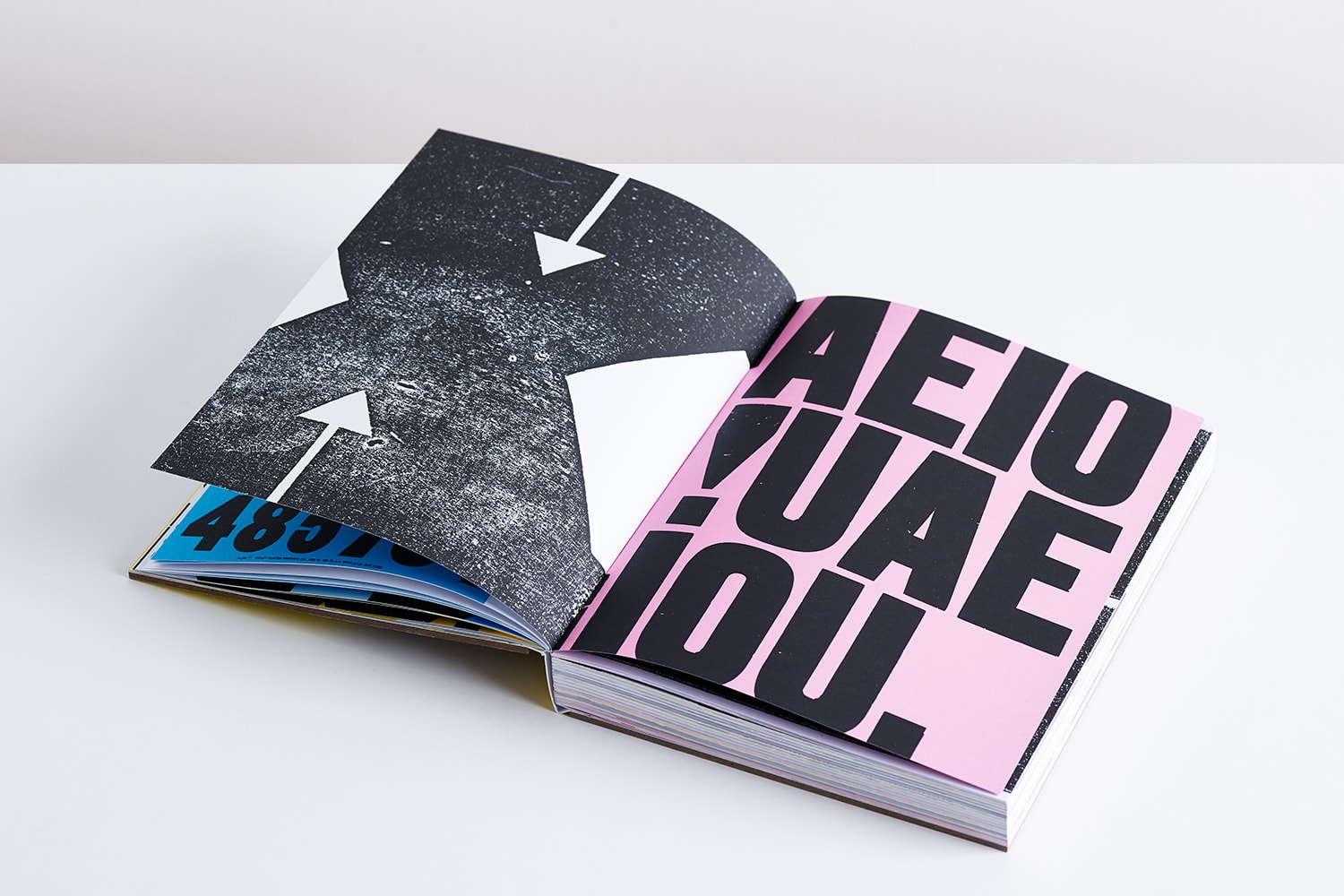

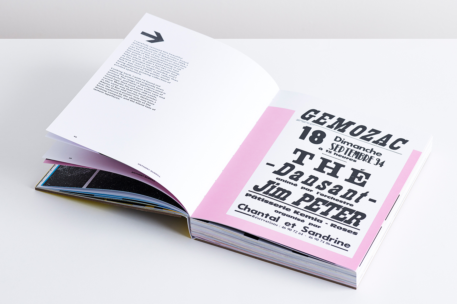

I really appreciate the way he handles the all very visually different elements to create one cohesive look. I find fascinating how he showcases beauty in the everyday objects that are often overlooked. I was so inspired by this book that I actually have ordered a copy.
Conclusion
This exercise would have been so helpful at the beginning of this module to help me discover these more inspiring sides of book design.
I have spent a considerable amount of time on this exercise, yet I feel like I hardly scratched the surface of what book design can be. I found this very inspiring and I have gained a newfound appreciation for books as physical designed objects.
I have not realised how much freedom this seemingly simple and repetitive medium can afford to designers who are willing to put in some extra effort to break away from the original form of the book. I love how some of these designers have created something so unique and exciting.
I will try to make a point in this module to see how far I can push my designs and to think about more than just what is designed in the digital medium as I have found books that have some special treatments and materials so much more exciting.
As Irma Boom says; the book is not a PDF!
